We’re investigating options for some of our enterprise clients around data enrichment.
ZoomInfo comes up as an option. I start checking it out.
Looks like a potential option. I’ll check pricing.
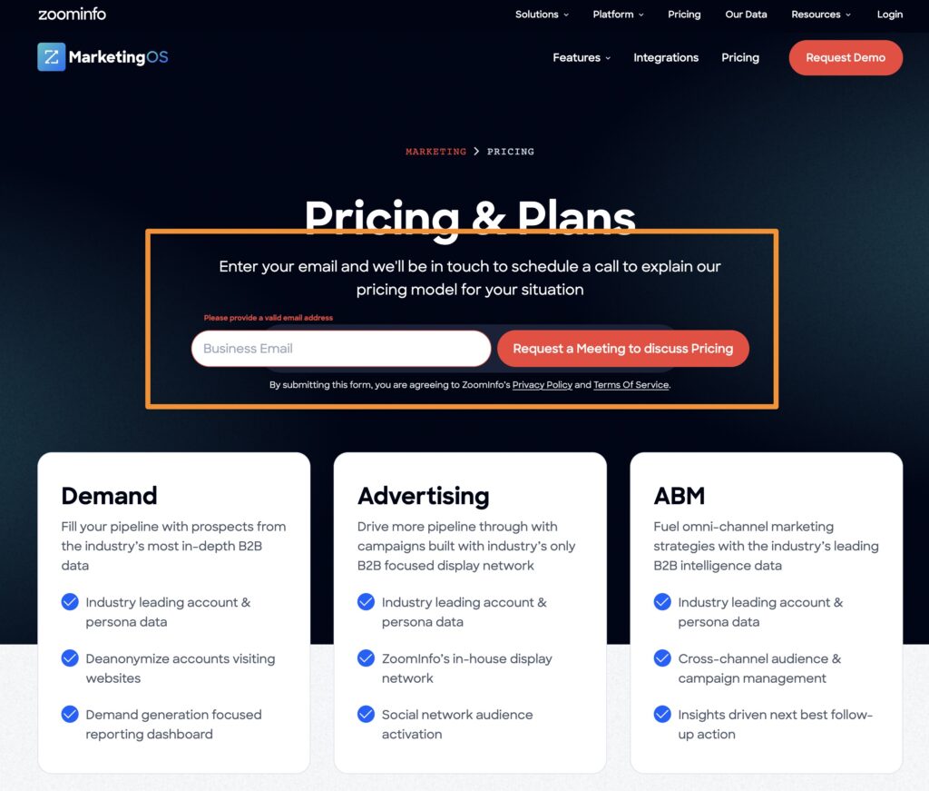
Here’s the pricing page – notice the View Pricing buttons:
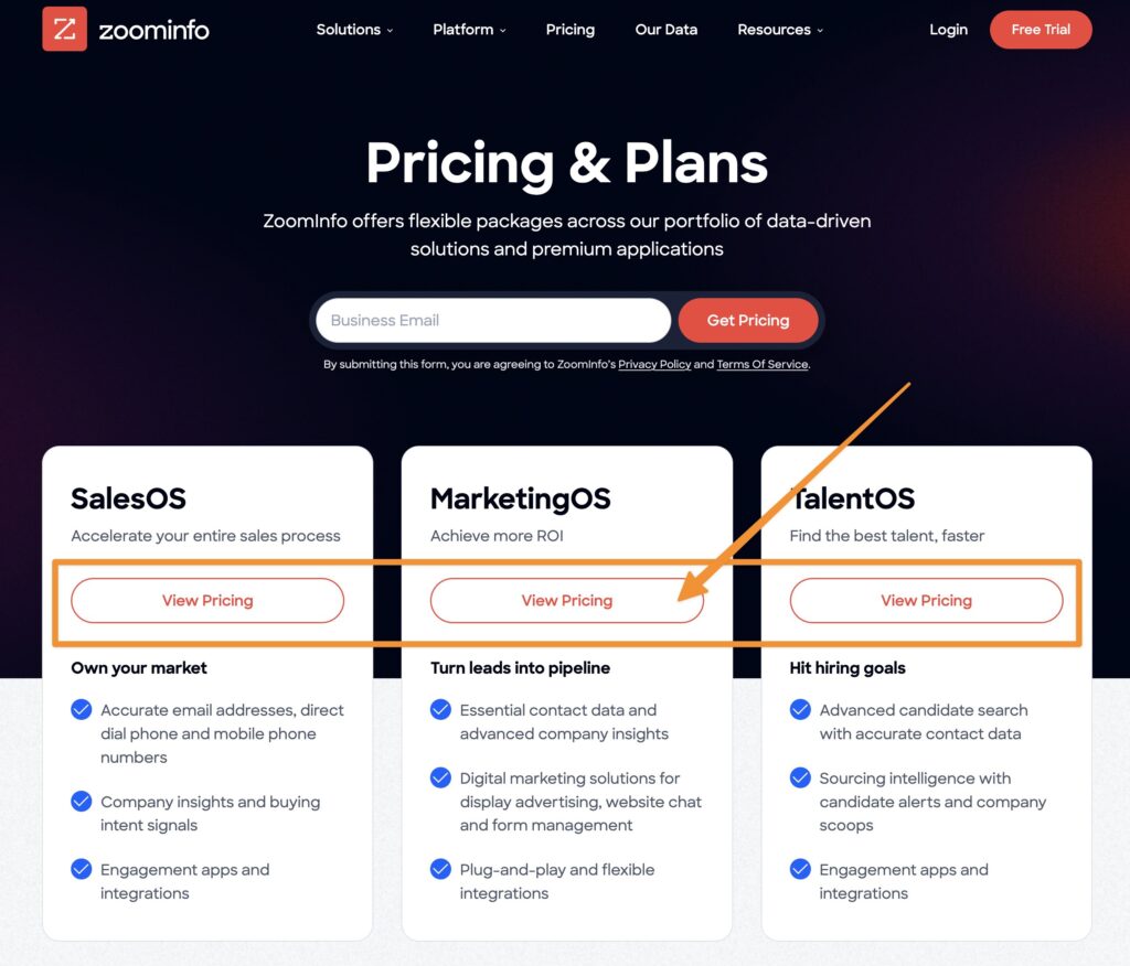
I click on the View Pricing button – here’s what I get:
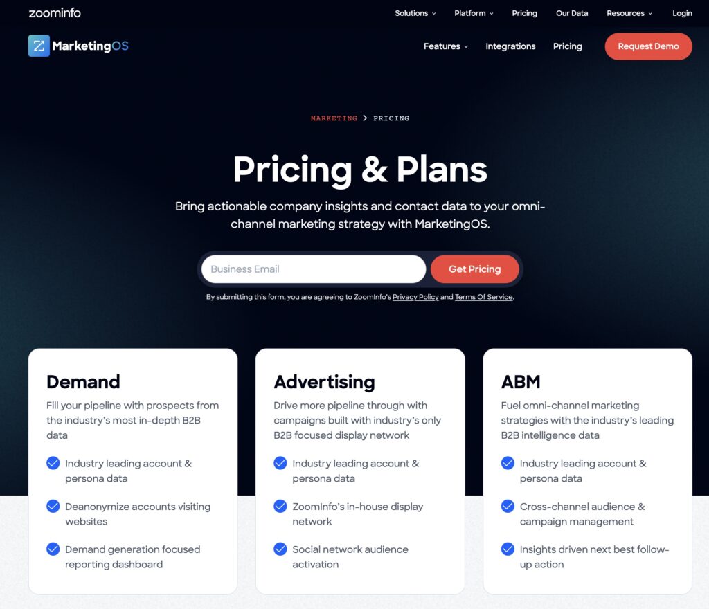
That’s right, there’s no pricing to View. Instead I have to fill in my email address. *Sigh*
OK, so I fill in the form and submit.
Here’s what I receive:
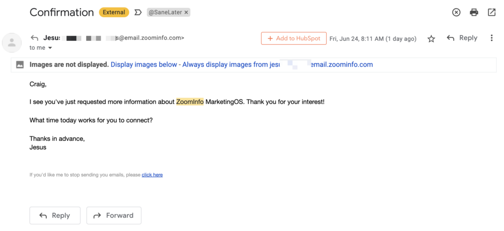
Yes, that’s right – no pricing at all. Instead an assumed meeting connection request.
I reply:
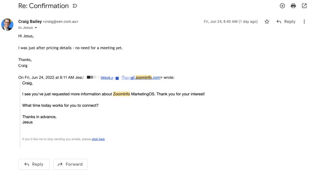
But unfortunately that’s not an option, because the pricing is apparently too complex to explain in writing:
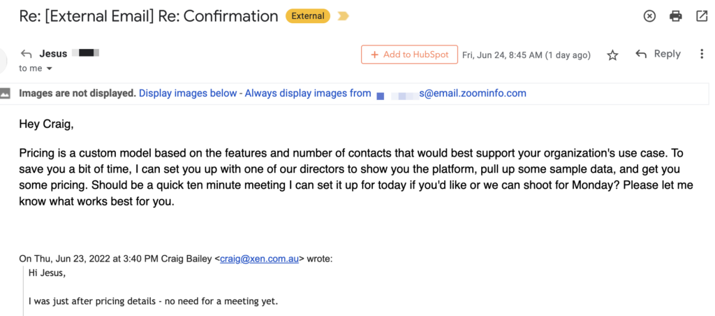
so I put an end to the frustration:
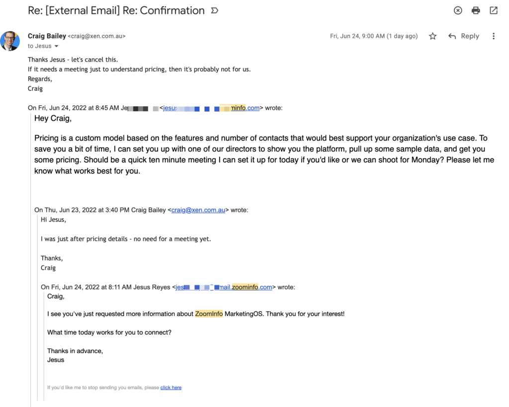
Or so I thought.
At the same time as this email thread is going on I miss a call – that’s right they are calling me now.
And then later in the day I get a call from someone else – even though I’ve clearly told them via email (above) I’m not interested.
And then this morning I receive this:
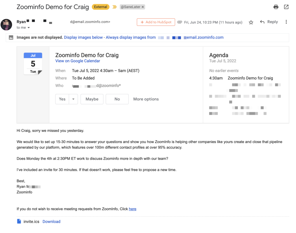
At this point, I click the link to stop receiving meeting requests. Thankfully that cancels the meeting as well.
But I’ve also started getting marketing emails from them:
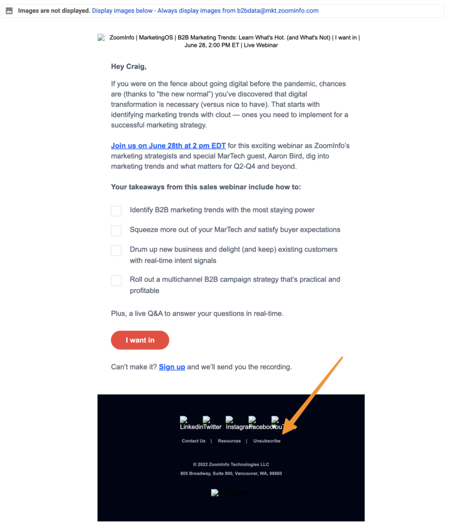
OK, fair enough – I guess I agreed to get spammed with event marketing emails when I requested pricing. At least I can easily unsubscribe from these (that link the orange arrow is pointing at above).
But, you’ll be shocked – shocked! – to learn that the unsubscribe link takes you this unsubscribe page:
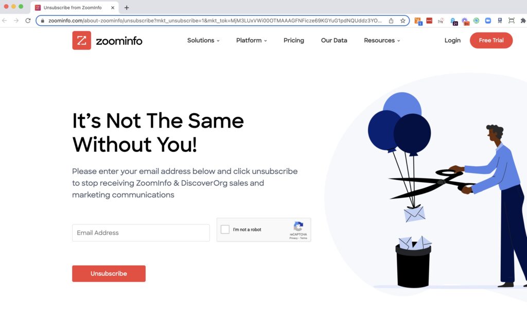
Yes, they make you enter your email address. An unsubscribe process right out of the 90s.
Everything about this experience with ZoomInfo is terrible.
Sadly, they are probably the norm.
But even worse, their impressive growth probably just encourages them to continue this approach.
So what’s the alternative? There’s two main options:
[1] Just put the pricing on your site (ie like HubSpot does and Salesforce does) [2] Explain the process for obtaining pricingSomething helpful like this mockup would be much better:
