Seriously, how would businesses survive if it weren’t for Excel? :-)
Excel is perfect for analysing analytics data in a variety of ways (eg using Pivot tables and Conditional formatting) and it keeps getting better.
I’m loving Office 2010 and Excel 2010 in particular – it’s just beautiful to use. In this post I want to highlight one of the ‘tiny’ new things in Excel 2010 that I love. It’s the new Sparklines feature. In a nutshell Sparklines allow you to analyse a range of data and display tiny trend graphs. They’re very handy for spotting correlating trends. Here’s a simple (contrived) example:

In this post I’ll go through an example of how I’ve used Sparklines to analyse some Google AdWords analytics and discover areas of opportunity. There’s plenty of other ways to analyse data– Sparklines are yet another cool way to present lots of information easily.
I use AdWords in my own businesses as well as managing AdWords campaigns for most of my clients. In the following example I’m using real e-commerce AdWords from a campaign targeting USA based customers.
To get the source data I’m using the new Day Parts report in the AdWords Beta section in Google analytics Traffic Sources. This is a new report released by the Google Analytics team recently. The data I’ll use is based on a month of traffic.
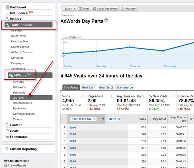
This is a great report – but it has two frustrations for me. First, I can only graph two metrics at a time, and second it doesn’t pull in the goal names onto the graph:

So instead I’m going to pull the data into Excel and analyse it there.
The report includes the usual analytics data (visits, pages/visit, time on site, etc) plus I’ll be pulling goal and ecommerce data to analyse as well (this site has numerous goals configured and ecommerce tracking enabled).
First, I’ll export the data:

And then open it in Excel
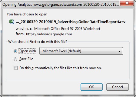
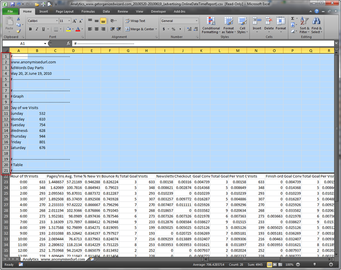
Once it opens I select the first 21 rows and delete them (right-click and choose Delete) since they only have summary details that I’m not interested in:
I’m left with just the data I wish to analyse. The first few columns are standard analytics metrics, and columns I, J, K onwards are configured goals (eg Newsletter = percentage of visitors who signup for a newsletter, Checkout = percentage of visitors who purchase a product, etc).
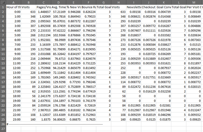
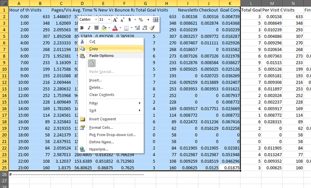
Currently I have the hour of day as a column down the side – to be useful I want to see that as a row across the top. No problem, Excel’s Paste with Transpose will take care of that for me. I select the columns I’m interested in, and copy (right click on the selection and choose Copy).
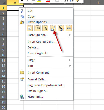
Next, I create a new worksheet and right click in the cell where I want to paste the data, and choose Transpose from the Paste options.
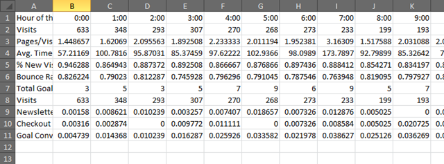
Now my data is looking more useful, but not yet in a format that’s easy to understand.
Inserting Sparklines
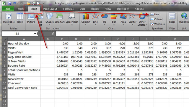
That’s where the Sparklines come in. I’ll insert a column, place my cursor in B2 and then choose to insert a Line type Sparkline from the Insert tab.
For my data range I simply choose the row C2 through to the end
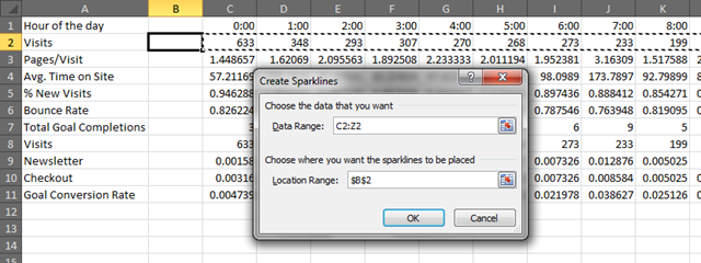
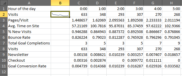
Here’s how the Sparkline looks
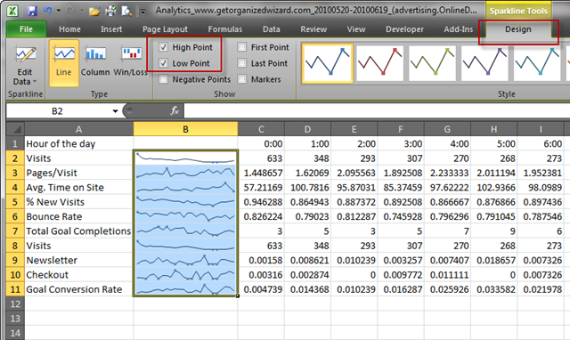
Next, drag the Sparkline cell down to copy it for all rows. Plus add High and Low points from the Design tab. Last, increase the width of column B so the trends are easier to read.
If I want to get really serious I can format the cells properly, add some conditional formatting and re-arrange the order of the rows to bring Checkout up to compare it more easily:

Benefits
The benefits are:
- I can see all of the main goal trends compared to each other in one snapshot
- The data is in a format that is easy to send to clients (I can embed them in documents explaining what actions I’m taking on their sites)
Analysing Trends
Now comes the interesting part. Based on the graphs I can easily highlight a few areas to investigate further. For example:
- Although traffic is highest at the start of the day (Visits)
- Interaction is highest a quarter way through (Pages/Visit) the day
- Which is also the time the most Total Goal Completions occur
- The best time for sales is about a third of the way through (Checkout)
- Engagement is highest at the end of the day (Avg. Time on Site)
- Newsletter signups are highest two thirds of the way through (Newsletter)
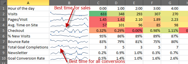
(Reminder: the reporting times are in Sydney local time, whilst the activity is in the USA – so don’t be distracted by all the traffic occurring between midnight and 1pm – it’s actually 7am-8am on the West Coast. The best conversion times are between 9am-10am Sydney which translate to 4pm-5pm USA time)
Where To From Here?
There’s a few actions we can take from this.
Note: is that this is just the start of the process – from here I’d investigate analytics more deeply around the times of best conversion. I’d dig deeper into the pages that are visited during that time, etc. But for simplicity (and to avoid an overly long post) let’s consider some example actions I might take:
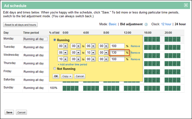
The first is I could use this to change the AdWords settings. Given that we want to increase the traffic as much as possible around the times of the best conversion rate (Checkout) I might increase the AdWords bidding just prior and during those times using the Bid adjustment Ad scheduling in AdWords:
Next we might use these results to help with other traffic sources – for example taking advantage of the higher engagement time at the end of the day. Perhaps AdWords is giving me some insight into the intent of visitors at that time – they’re more into information seeking, than purchasing. Maybe this is a good time to promote information pages on social networks, whilst earlier in the day is better for linking to sales pages.
Finally, you might use these results to influence when to send out email campaigns. Since visitors tend to sign up for newsletters mostly around two-thirds the way through the day, then that might indicate an interest in consuming newsletters at that time too. Schedule email newsletters for that time frame and test further.
Disclaimer: Obviously these are some simplistic conclusions to arrive at so quickly, but they do highlight the benefits of simple comparison trending using Sparklines. Every situation is unique and requires it’s own testing, but I hope you can see the potential opportunities that can be highlighted.
Summary
So there’s a simple real-world example of using Excel’s new Sparklines feature to easily analyse data, and make some informed decisions about improving performance. Let me know of any further ideas you may have in the comments.
Great Post Craig.
I would like to see Sparklines used with a hyperlink (wonder if that’s do-able).
Therefore, hide the data, just show the sparkline, and then hyperlink to drill down to the detail level.
That’d be very handy! You can attach hyperlinks to a cell, but can’t really attach it to the Sparkline as far as I can work out. :-(
Using Excel 2010 Sparklines to Analyse Google Analytics http://bit.ly/dcGcik
Using Excel 2010 Sparklines to Analyse Google Analytics http://bit.ly/dcGcik
RT @craigbailey: Using Excel 2010 Sparklines to Analyse Google Analytics http://bit.ly/dcGcik
RT @craigbailey: Using Excel 2010 Sparklines to Analyse Google Analytics http://bit.ly/dcGcik
Great post RT @craigbailey: Using Excel 2010 Sparklines to Analyse Google Analytics http://bit.ly/dcGcik
Great post RT @craigbailey: Using Excel 2010 Sparklines to Analyse Google Analytics http://bit.ly/dcGcik
Great post Craig!!! Many thanks
Great post Craig!!! Many thanks