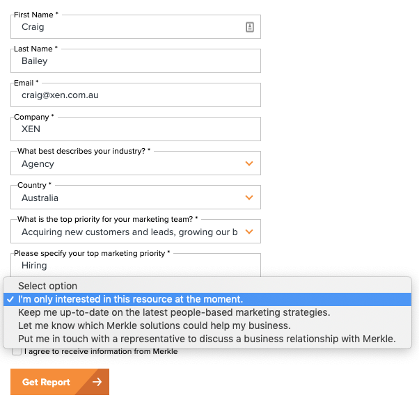
I really like this form on the Merkle Digital Marketing Report landing page:

Which when selected in the form appears like this:

This is a better user experience for everyone – the people downloading the report and for Merkle.
I’m only interested in the report, so it saves them, and me, time. There’s no use them trying to follow me up if I’m not interested. Instead all I’m expecting is a semi-regular follow up newsletter – likely high value and low sales push. And I’ll bet it’s tailored to the priorities I mentioned in the form submit.
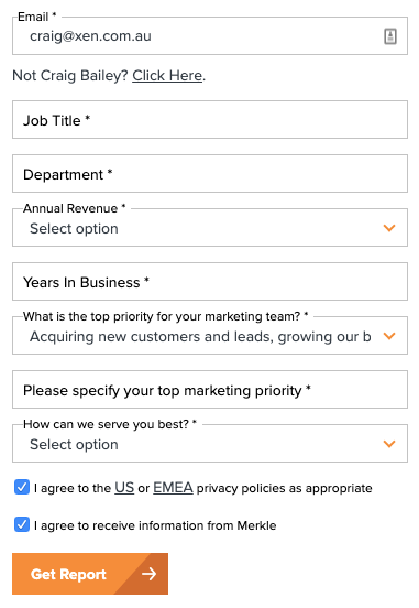
Further to this, here’s what the form looks like after I submit (and revisit the page) – nice use of progressive form fields:

One other thing: no phone number request.
All in all: a good form and user experience.
(If you are interested, this is a Pardot form ie not HubSpot. But HubSpot forms have all this same functionality as well – so here’s a reminder to be making use of it)